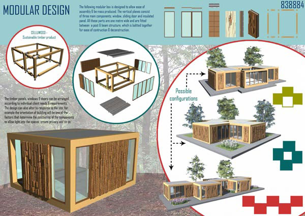
Design Presentation Tips
When presenting a single design or an entire design portfolio there are certain tips and techniques that you should consider. If you are creating a presentation board for an interior design project, visit our extended article specifically dedicated to Interior Design Presentation boards. When presenting a design concept board information contained within the presentation drawings can be supplemented by accompanying text. This text is another important element in the design of a graphic presentation. The display of text needs to be considered, it might be boxed out or weaved into the actual drawings. In terms of the general layout of a presentation board consider these tips.
General Presentation Tips:
- A good presentation should not be cluttered, it needs to have sufficient space to allow the information to be easily read and absorbed.
- The information may be rendered in varying sizes or using different graphic styles and techniques.
- The content should align purposefully as this will help the viewer read the individual elements as a collective set.
- The graphic presentation style you choose should complement the design idea being conveyed and of course the presentation should clearly communicate the designers idea, concept and intention.
- Overall keep it clear and simple.
- Remember that any text is supplementary; the drawings should remain the primary means of communication and the focal point of the presentation.
When planning a design presentation portfolio needs careful consideration and organisation, but using a storyboard framework can help you organise the content of your portfolio of work. Before you begin follow these steps...
Portfolio Presentation Tips:
- Determine the audience for your presentation. What will they want to see?
- Write an outline or brief for your presentation
- Draw up a sequenced list of content for you presentation
- Consider the best format and layout of the sheet(s)
- Choose a font style and size that will compliment your images. Remember you will need to use the font consistently throughout
- Consider the distinct, separate sections of your presentation
- For concept boards, denote the creative journey of your presentation. Indicate in words and sketches the sequence of the project and the specific images associated with it
- For multiple page projects, label each page according to the sequenced list of contents you compiled earlier.
- Consider how the content connects to one another. Edit and revise where necessary until you are happy with the narrative
- Once happy with everything, assemble your portfolio so it corresponds with the flatplan.
Design Presentation Tips
 Reviewed by Opus Web Design
on
November 23, 2015
Rating:
 Reviewed by Opus Web Design
on
November 23, 2015
Rating:


