CSS Positioning and Layering
 |
| CSS positioning is a lot more advanced than just top, middle or bottom! |
CSS Positioning
With CSS positioning, you can place an element exactly where you want it on your page. Together with floats, positioning gives you many possibilities to create an advanced and precise layout. To help us understand imagine a browser window as a system of coordinates, as in the image below. |
| Browser window screen coordinates for use with CSS Positioning |
The principle behind CSS positioning is that you can position any box anywhere in the system of coordinates. Let's say we want to position a headline. By using the box model we can make a headline appear as follows...
If we want this headline positioned 100px from the top of the document and 200px from the left of the document, we could type the following in our CSS:
The result will be as follows...
 |
| CSS Positioning |
As you can see, positioning with CSS is a very precise technique to place elements.
Note: The element is positioned from its top left corner.
Absolute or Relative Positioning
There are two types of positioning, absolute and relative. In the sample above we used absolute positioning . An element which is positioned absolute does not obtain any space in the document, which means that it does not leave an empty space after being positioned. To position an element absolutely, the position property is set as absolute. You can subsequently use the properties left, right, top, and bottom to place the box. As an example of absolute positioning, the CSS code below would place 4 boxes in each corner of the browser window.The difference between absolute and relative positioning is that for an element which is relatively positioned the position is calculated from the original position of the element in the document.
To position an element relatively, the property position is set as relative. That means that you move the element to the right, left, up or down. This way, the element still obtains a space in the document after it is positioned. An example code is shown below...
Tip: When using positioning it is recommended that you use either all absolute positioning or all relative positioning, mixing the two types can lead to problems, especially when the page is being viewed in different browsers. In my opinion it is best to use relative positioning, but don't just trust me try it out for yourself.
CSS layering with z-index
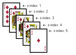
CSS operates in three dimensions, height, width and depth. In this lesson, we will learn how to let different elements become layers. This means we will be able to let elements overlap one another. To do that, you can assign each element a number using the CSS property z-index. The element with a higher number overlaps on top of an element with a lower number. Let us say we are playing poker and have a royal flush. Our hand can be presented in a way where each card has got a z-index: |
| CSS layering with z-index |
The method is relatively simple but the possibilities are numerous. You can place text over images or text above text etc. Try it yourself to create effects in headlines or banners.
Next Up
Our ten steps to learning CSS has come to an end but we have a treat in store will a selection of CSS resources just for you coming soon. (sign up to our newsletter to be first to hear about their release)
http://www.onlinedesignteacher.com/2016/03/css-positioning-and-layering.html
CSS Positioning and Layering
 Reviewed by Opus Web Design
on
March 23, 2016
Rating:
 Reviewed by Opus Web Design
on
March 23, 2016
Rating:


